Visual identity
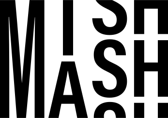
The MishMash identity was designed in 2026. It consists of a stacked wordmark, four pastel surface colours with a matched wordmark colour for each, and a bold condensed typeface. This page collects the rules and the files. The same information for developers and automated tools lives in BRAND.md in the website repository.
Wordmark
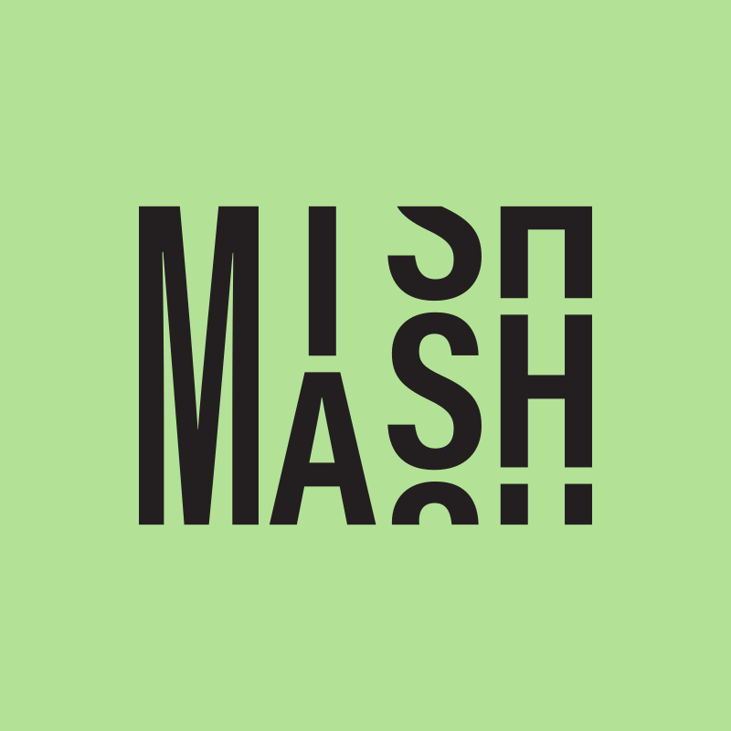
The wordmark stacks MISH over MASH, with the letters rolling through the frame as if on a split-flap board. Use it as delivered: do not retype, stretch, outline, rotate or add effects to it. Keep clear space around it of at least the height of the letter M divided by four, and never place it smaller than 24 px tall on screen or 8 mm in print.
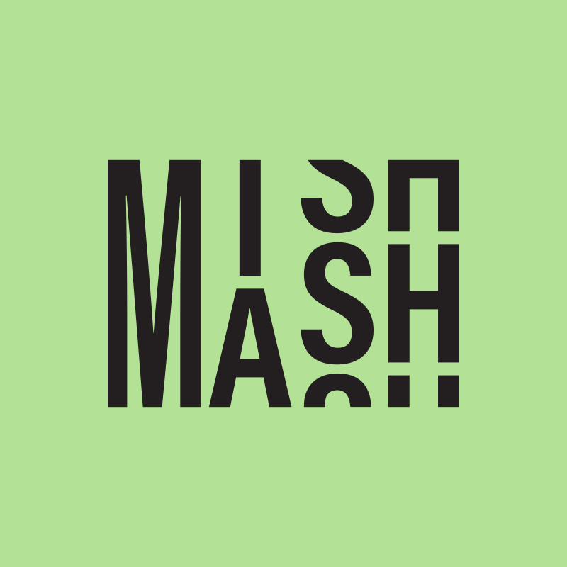


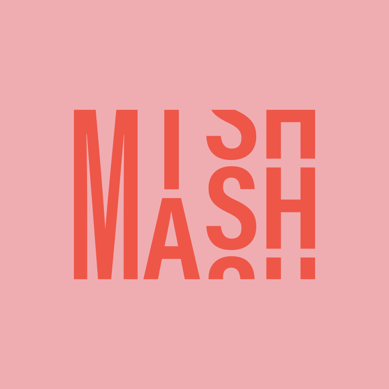
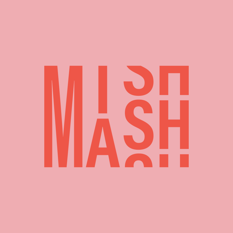
Each surface colour has exactly one wordmark colour: black on green, green on purple, yellow on blue, red on pink. On white or on photographs use the black or the white wordmark.
Colours
Green, purple, blue and pink are the surfaces: use them for large areas such as headers, posters and signage. Text on any of them is always ink. Yellow and red are accents that only appear as the wordmark on blue and pink, or as small highlights. There are no gradients, shadows or rounded corners in the identity.
Type
Weekly MishMash Gathering
The display typeface is Acumin Variable Concept Condensed Bold, set tight (44 pt on 33 pt in the identity sheet). Acumin is a licensed Adobe font; it is used in print and in files the design agency produces. On the website, which serves fonts from its own server and loads nothing from third parties, the open-licence Roboto Condensed Bold stands in for it. Body text is Inter.
Downloads
- Wordmark, black (SVG) · PNG
- Wordmark, white (SVG) · PNG
- Wordmark, animated (SVG)
- Colourway tiles: green · purple · blue · pink
- Social media image, 1200 × 630 (PNG)




Questions about the identity or requests for other formats: contact@mishmash.no.